ReactAwesome Slider
<AwesomeSlider/>~7KB compressed
React Awesome Slider is a 60fps, extendable, highly customisable, production ready javascript react component that renders an animated set of UI gallery sliders.
Captioned Images

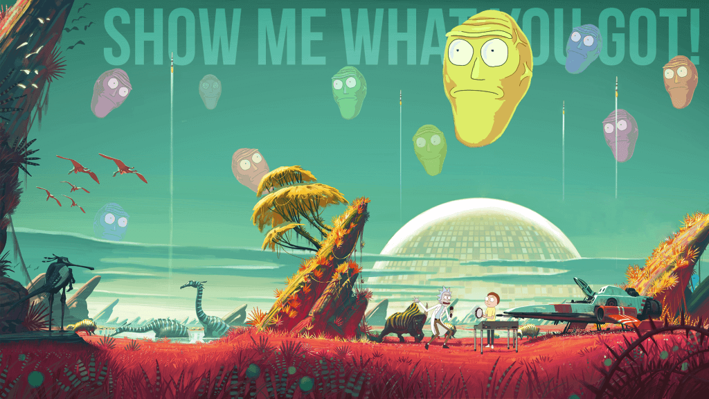
I want to see what you got.
Basic Children Usage
.jsx
import AwesomeSlider from 'react-awesome-slider'; import AwsSliderStyles from 'react-awesome-slider/src/styles.scss'; const slider = ( <AwesomeSlider cssModule={styles}> <div data-src="/path/to/image.jpg"> <p>I want to see what you got.</p> </div> <div data-src="/path/to/image.jpg"> <p>The answer is -- Don't think about it.</p> </div> <div data-src="/path/to/image.jpg"> <p>Sometimes science is more art than science.</p> </div> <div data-src="/path/to/image.jpg"> <p>Love, connection, experience.</p> </div> </AwesomeSlider> );
Captioned Component
For this specific example I'm using the Captioned component which is a basic styled wrapper hoc that applies a simple caption strategy. You can check out all the available components here.
.jsx
import Captioned from 'react-awesome-slider/src/components/captioned'; import CaptionedStyles from 'react-awesome-slider/src/components/captioned/styles.scss'; const component = ( <Captioned startupScreen={StartupScreen} cssModule={CaptionedStyles} screens={[ { backgroundColor: '#4a9c8c', media: '/images/series/ricknmorty-3.png', caption: 'I want to see what you got.', }, { backgroundColor: '#4a9c8c', media: '/images/series/ricknmorty-3.png', caption: 'The answer is -- Don't think about it.', }, // ... ]} /> )
Customisation
Basic customization through the component's props and CSS custom-properties.
Component's global props
- true
- true
- false
CSS Custom Properties
- 60%
- 770ms
- 4px
- 0px
- 40px
- #3f8577
- 10%
- 25%
- transparent
- #4a9c8c
- #3f8577
- #851515
- 6px